I've blogged about HDR before but briefly they are made by using a program to merge several different exposures levels of a scene. The different exposure levels may be created by using different shutter speeds on the camera to create separate under and over exposed images or by using a single image and then making copies with different exposure levels. Sometimes when I look at a scene I can tell that the dynamic range is greater than the camera can handle and I will take three shots at the time. Other times I will look at an image in post processing and see that it would be suitable for processing as a tone mapped HDR. The following images are a mixture of both types but mainly are taken from single images.
In the software there is a lot of control over how the images are merged which can range from realistic to surrealistic. In a realistic merge the aim might be to bring out some of the detail in the shadows and highlights, which a single image would lose due to the range of the tones. The human eye can see more than twice the range in tones as a camera so this can be a useful technique in certain conditions. In a surrealistic merge the aim is to push the contrast and saturation way past realism which gives the impression of a scene that has been painted with pastel colours and can give almost a cartoon like quality to some images.
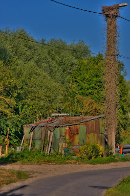
On our first day in France we went for a walk around a village called St. Firmin and this image is of an old corrugated iron shed at the side of the road. I included this photo in the original holiday blog for day 1 but I felt that making a tone mapped image would add an extra dimension to it.
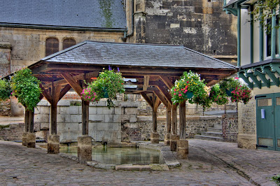
On our second day we reached Honfluer which is a beautiful little port and on our first visit we went past this odd shelter over a shallow pool which was outside a church. I've seen similar structures near churches all around France but never figured out their purpose. I speculate that it could be some kind of washing ritual but if any one knows please tell me. In the day 2 blog I have a picture from the other side of this shelter but I thought this image lends itself more to tone mapping. In the original version of this photo the underneath of the shelter roof is almost totally black but in this version the lovely colour in the old wood looks really good.
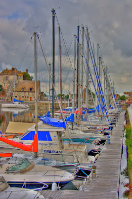
The next image is in the harbour area of Honfluer and is looking down the line of boats moored at the wooden jetty. The tone mapping has really pulled out the red and blue parts of the boats and also the line of weeds along the harbour wall. In the middle right distance is the carousel and in the centre distance is the red top to the lighthouse.
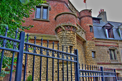
The next three images are all from Trouville sur Mer which we visited while staying at Honfluer. I really loved the architecture here and the first image is a different photo of the castle house. This was at the end of a row or fairly ordinary looking houses and the owners had really gone to town converting the original part of the house and then adding a massive extension in the form of a castle. Through the fence on the left is the big arched wooden door with the large old fashioned door knocker. The chain goes down to a pretend wooden drawbridge. Totally bizarre, but at the same time truly wonderful.
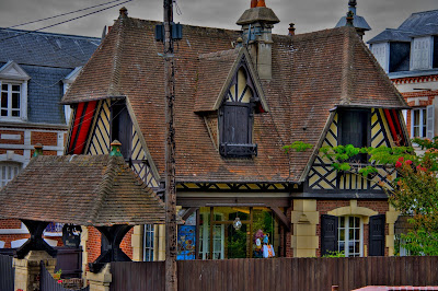
The next image was a gift shop with a difference. I love the really steep L-shaped roof with the window in it and the twin gable ends with the cream and black wood framing. Then there is the sort of lychgate with the roof that matches the building and the sign hanging down. The telegraph pole does spoil the overall image a tad but in the tone mapped version even the telegraph pole has quite a nice texture.
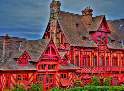
The final image was the hotel from the original post but the saturation from the tone mapping has made the paintwork almost fluorescent. I think maybe I pushed this image too far but I don't care. I loved the original version but this one shouts out and grabs you by the throat. Looking at the two images side by side I can see that the reds are so blown out that there is some detail being lost so maybe I'll re-process it and try and get some of the detail back.
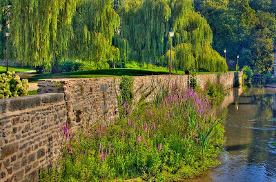
Our next stop was Fougeres and this image was of the river next to the chateau. A version of this image was in the original blog post but in this version as well as tone mapping the image I have cropped in much tighter. I did the cropping to remove the skyline and also the buildings on the right of the image. I feel the new crop gives much more emphasis to the stone wall, the weeds in the river and the willow trees in the park. I'm not sure if I should crop even more from the right hand side to completely remove the building in the distance and that little patch of weed on the right hand side near the bottom.
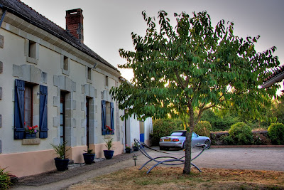
The next two images are from the gite at Les Fourneaux near Doue la Fontaine where we stopped for a week. The first is of the gite with my car parked outside the garage. This was one of the photos where I took three images in the camera because the sun was high and I was facing almost directly into it. On the original images there was quite a bit of flare down the left side which went very odd when I did the tone mapping. I ended up cropping it off because it went a sort of milky light blue down the gable end of the gite. The sky is totally blown out and the tone mapping has bee unable to rescue it, but I love the image because it just brings back so many memories of our stay in the Loire Valley.
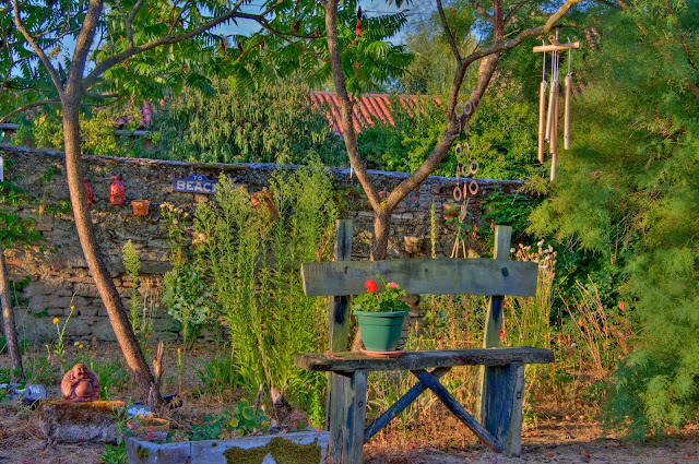
The final image in this set is called 'La Jardin de Tranquilite' and is my favourite of all the tone mapped images from France. To be honest it was the first one I processed in this way and the one that gave me the idea for the whole exercise. I have printed this image out on matt photo paper at A3 and I think it is stunning, maybe a bit busy but stunning. It is of an area in the garden of the gite where the owners have hung lots of different types of wind chimes which made beautiful noises as the breeze blew. There's also lots of nice plants, plant pots, statues and pieces of slate with peaceful types of words painted on them. I took the name for the picture from the slate behind the Buddha statue, although I think it might be spelled wrongly because it has a double 'l' in it. I could be wrong, I'm no expert in French.
By the way, clicking on an image will bring up a much larger version (about half full size in this set). Next time the rest of the tone mapped HDR images.


No comments:
Post a Comment